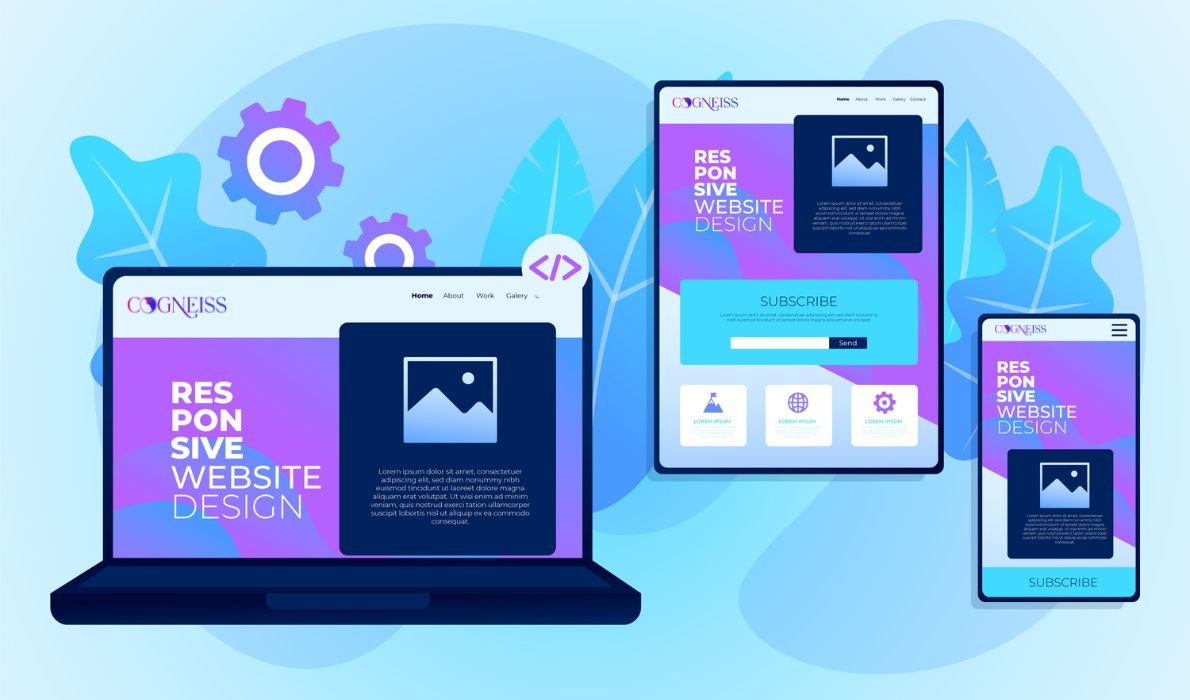
Mobile-First Design: Why Your Website Needs It in 2024

Mobile-first design is important in 2024 because its taking leads to a website. Google really likes sites
that work well on smartphones. A clean layout, easy-to-load media, and testing across devices are
key parts of this design approach. By creating user-friendly experiences for small screens, businesses
can boost conversions and stay competitive. Embracing mobile-first principles can help companies
attract and keep customers in our mobile-focused world. As trends change, adopting this design
philosophy will help ensure that websites stay effective and engaging for everyone, no matter what
device they use. And with the availability of free web development tools, implementing these design changes has become easier and more cost-effective for businesses of all sizes.
What is Mobile-First Design?
Without a mobile-friendly site, you risk missing out on potential visitors. Imagine a user struggling to navigate a poorly optimized site on their phone—frustrating, right? This is why UI/UX design that caters to mobile is crucial in today’s digital landscape.
Why Prioritize Mobile-First Design in 2024?

- Where Your Audience Is Over half of internet traffic comes from mobile devices. Your customers are on their phones during commutes, at home, or on breaks. A non-mobile-friendly site is like being invisible.
- Google Favors Mobile-Friendly Sites Google uses mobile-first indexing. It ranks sites based on their mobile versions. If your site isn’t mobile-optimized, you’ll drop in search rankings. A mobile-responsive site boosts visibility and traffic.
- Better Experience, More Conversions Everyone wants an easy browsing experience. Difficulties on mobile can drive users to competitors. Mobile-first design ensures your site is easy and appealing on any device, boosting engagement and conversions.
- Stay Ahead of Trends 2024 is about innovation. Mobile-first design is a key trend. It shows you care about customer experience. Being an early adopter sets you apart from less forward-thinking competitors.
How to Implement Mobile-First Design
- Start Simple
Create a clean layout that highlights key information. Focus on readability and easy
navigation. Remember, less is often more. - Optimize Media
Large images can slow your site. Compress images without losing quality. Use responsive
images that adjust to screen size. - Test
After designing, test on various devices. Gather feedback and make improvements.
Wrap-Up: Don’t Get Left Behind
Ready to upgrade your site? Embrace mobile-first design with Cogneiss, and watch your online presence grow!


