Pitchfork Partners
- Laravel
- React
- React Native
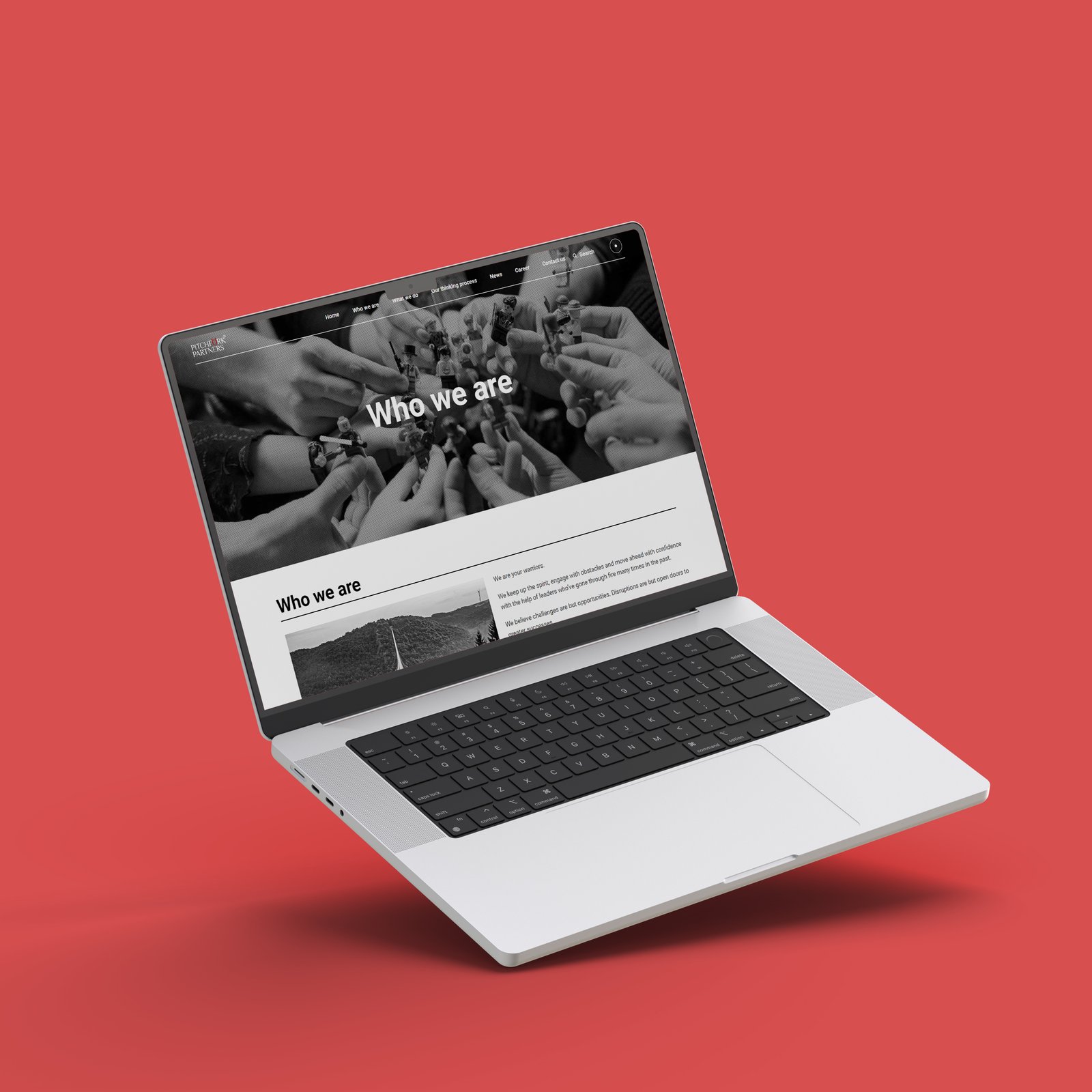
Pitchfork Partners is a strategic communication consultancy that helps brands build credibility and reputation. They approached us with a need for a sleek and professional website that would effectively communicate their services, thought leadership, and case studies while representing their brand ethos. The goal was to build a digital platform that positioned them as a leader in the industry, with a clear focus on user experience and engagement.
Industry
- Advertising and Marketing
Scope
- Web Development

Challenge
Pitchfork Partners required a website that could:
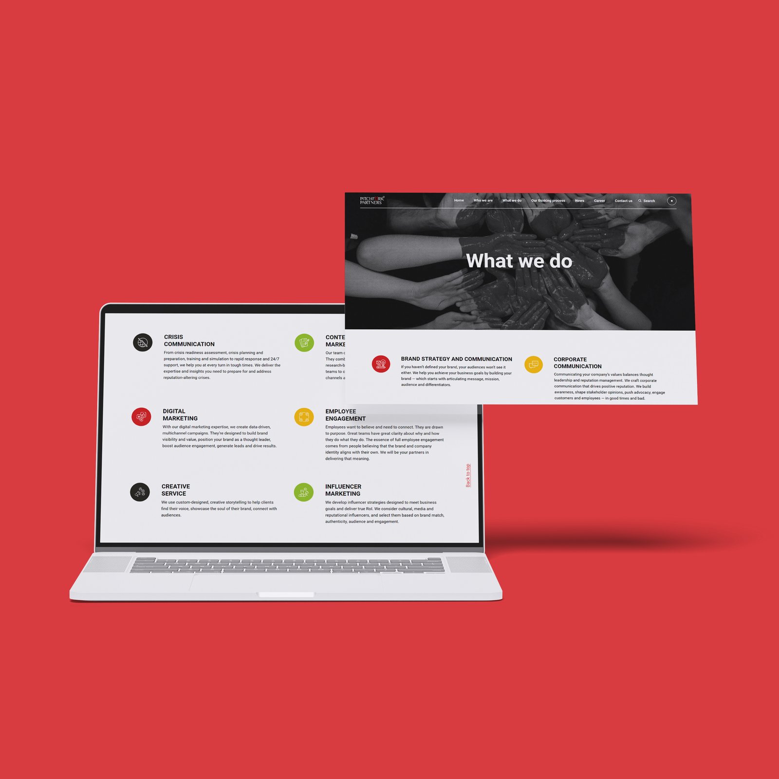
- Showcase their wide range of services, including strategic communications, reputation management, and digital strategy.
- Present their portfolio of successful projects and thought leadership content.
- Highlight their expertise in multiple industries while maintaining a clean, professional aesthetic.
- Be easily navigable and accessible across devices.
Our challenge was to design a website that not only presented Pitchfork Partners’ services in an engaging way but also conveyed their industry leadership and trusted reputation.
Research and Discovery
To ensure the website aligned with Pitchfork Partners’ goals, we began by conducting in-depth interviews with the team and stakeholders. We also analyzed their competitors’ websites to understand the digital landscape of communication consultancies. Key findings included:
- The need to present complex service offerings in a digestible, user-friendly manner.
- A desire for clear calls to action to guide potential clients toward contacting the company or exploring case studies.
- A website that could handle regular updates for new projects, blogs, and industry insights.

Design and Prototyping
We moved forward with wireframes and mockups, focusing on delivering a website that emphasized clarity, professionalism, and ease of navigation. Our design approach prioritized:
- Minimalist, Professional Aesthetic: We opted for a clean, modern design with bold typography and a neutral color palette to reflect Pitchfork Partners’ professionalism and industry expertise.
2. Organized Information Architecture: We carefully structured the site’s navigation and content layout to ensure users could easily find the information they needed.
3. Visual Case Studies: To showcase Pitchfork Partners’ work, we developed visually rich case study pages featuring client stories, challenges, and successful outcomes.
4. User-Centric Design: The design included intuitive user journeys, from landing on the homepage to exploring services, and ultimately, contacting the team for inquiries.
Development Process
Key features of Realteo iWe adopted an Agile methodology, allowing us to iterate on the design and development process based on ongoing feedback from the Pitchfork Partners team. Key technologies used included:nclude:
Frontend: Built with WordPress to allow easy content management and updates by the Pitchfork team.
SEO Optimization: Built-in SEO best practices to improve organic search visibility.
Responsive Design: Ensuring a seamless experience across desktop, tablet, and mobile devices
Key Features Developed
Service Pages: Detailed service pages that explain Pitchfork Partners’ offerings in strategic communications, reputation management, and digital strategy. Each page was designed to provide clarity and encourage users to explore further.
Case Studies Section: A portfolio of case studies showcasing the agency’s success stories. Each case study is accompanied by visuals and clear explanations of the client’s challenge, Pitchfork’s approach, and the outcomes achieved
Thought Leadership Hub: A blog integrated into the website to allow the Pitchfork team to share industry insights, news, and thought leadership articles, establishing their credibility as leaders in the communications industry.
Contact Forms and CTAs: Strategically placed calls to action, ensuring visitors can easily reach out for inquiries or service requests.
Fast Load Times: Performance optimization to ensure the site loads quickly, enhancing user experience and reducing bounce rates.
Testing and Launch:
The revamped website successfully launched and received immediate positive feedback. Some key outcomes include:
Enhanced User Experience: Visitors praised the ease of navigation and the clarity of information, which led to longer session times and reduced bounce rates.
Thought Leadership Engagement: The thought leadership hub saw a steady increase in readership, establishing Pitchfork Partners as a trusted voice in the communications industry.
SEO Performance: The SEO optimization resulted in improved organic search rankings, helping more potential clients discover Pitchfork Partners’ services.
Conclusion
The new website for Pitchfork Partners perfectly encapsulates their professionalism and industry expertise, while also delivering an engaging and intuitive user experience. By combining sleek design with a clear focus on usability and scalability, we successfully delivered a platform that supports their business goals and strengthens their digital presence.
This project showcases our ability to create a high-performing website that aligns with the brand’s vision and provides tangible results, positioning Pitchfork Partners as a leader in their field.

